Astryx: An open source design system that's customizable and agent ready
Meta open-sourced Astryx under the MIT license, releasing a React 19 design system powering over 13,000 internal apps with 150 components for humans and AI.
By Dillip Chowdary • Nov 08, 2026 • Source: github.com
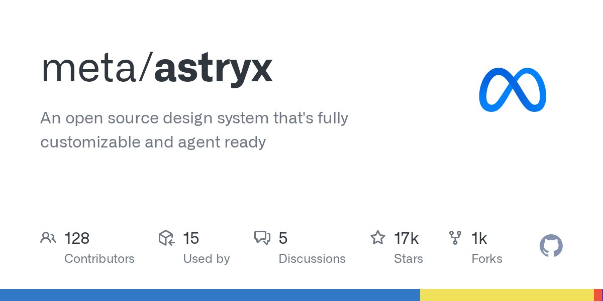
Meta released Astryx as an open source design system under the MIT license after eight years powering 13,000 internal applications. According to github.com's report, the beta release provides 150+ accessible components, themes, and a CLI on React 19+ and StyleX for developers and AI agents.
This technical report examines the Astryx release, covering its component architecture, peer dependencies, CLI tooling, and customization workflows. It is written for engineering leaders and frontend developers standardizing UI systems across human programmers and autonomous coding assistants without proprietary build plugins or styling library lock-in.
01What actually changed
The release transitions Meta's internal UI framework into an open modular ecosystem on npm, with functionality structured across clear package boundaries. Distribution centers on @astryxdesign/core for base components, theme runtime, and utilities, alongside @astryxdesign/cli for scaffolding and codemods.
Styling relies on @stylexjs/stylex as a peer dependency, while build plugins reside in @astryxdesign/build. Theming is divided into seven packages including neutral, butter, chocolate, matcha, stone, gothic, and y2k presets, letting engineering teams consume pre-configured design tokens directly without custom compilation passes or external styling layers.
Beyond stable primitives, Meta clearly isolated experimental utilities from the production release. The repository keeps @astryxdesign/lab unreleased on npm, using it strictly for internal Storybook and sandbox testing.
Data visualization is segregated into @astryxdesign/vega, wrapping Vega-Lite, and @astryxdesign/charts, both published only under npm canary tags without stable release guarantees. Internal testing tools, eslint plugins, and vibe tests remain contained inside the repository internal tooling directory, ensuring consuming enterprise codebases depend only on verified, stable runtime APIs while contributors test shared DOM and StyleX setups.
02How it works
Integrating Astryx requires React 19 or later as a peer dependency across react and react-dom packages. Teams install @astryxdesign/core, @astryxdesign/theme-neutral, and @stylexjs/stylex, alongside the development dependency @astryxdesign/cli using npm, pnpm, or yarn.
Setup involves importing pre-built CSS files and mounting a theme provider, requiring no Babel, PostCSS, or bundler plugins. The CLI can be installed globally or run locally via package scripts, which prevents path errors when automated artificial intelligence coding assistants or junior developers invoke commands such as component listing directly.
While Astryx authors component styles using StyleX, that implementation remains invisible to consuming applications. Engineers can override component styling using standard className properties with Tailwind CSS, CSS modules, or vanilla stylesheets without fighting library abstractions.
For deeper customization, running swizzle ejects full component source code directly into the local project. Themes consist of CSS custom property overrides, letting teams modify brand aesthetics without wrapping base components, authoring custom higher-order abstractions, or maintaining separate codebase forks across disparate product applications in their organizations.
Advertisement
Tech Pulse Daily
Get tomorrow's pulse first
Join engineers who read Tech Pulse before stand-up. Free, weekday mornings.
03Why it matters
Design systems frequently impose rigid guardrails that force engineers to maintain fragile wrappers or abandon libraries entirely. Astryx addresses this friction through four stated principles: guidance over enforcement, strong documented conventions, one system for humans and AI, and patterns earned by measurement.
By prioritizing capability over constraints, components render whatever values developers pass, delegating opinions to documentation and examples. Uniform naming rules ensure developers and AI agents can predict component behaviors reliably across unfamiliar interfaces, preventing brittle configuration patterns and unnecessary abstraction layers during implementation.
Designing APIs for human developers and artificial intelligence agents simultaneously creates shared ergonomic benefits across codebases. Every convention that simplifies code generation for automated assistants improves clarity for software engineers.
Rather than enforcing rules through rigid runtime checks, Astryx grounds its conventions in empirical data collected across 13,000 Meta applications over eight years. The repository architecture organizes apps, packages, and internal utilities into distinct directories, demonstrating how large-scale enterprise component libraries can scale safely across distributed technical organizations without sacrificing long-term design consistency.
04Who is affected
Frontend engineers building on React 19 gain immediate access to 150+ battle-tested interface primitives without adopting specialized bundler plugins or new styling syntaxes. Teams constrained by closed-box component APIs can utilize open internals, composing nested primitives or ejecting source files via swizzle when requirements diverge from default behavior. Because styling accepts standard className overrides, organizations using Tailwind CSS or CSS modules can integrate Astryx components incrementally into existing projects without refactoring global stylesheets or introducing build overhead into production deployment pipelines.
Design system teams and platform architects benefit from the streamlined maintenance model enabled by CSS custom property theming. Designers can implement brand redesigns, custom palettes, or dark mode variants by publishing variable overrides without altering underlying component logic. Furthermore, organizations deploying AI coding agents receive structured CLI tools and documented conventions that minimize generation hallucinations, ensuring automated workflows produce accessible, syntactically valid React code that adheres to standard production design patterns without requiring manual developer intervention or custom wrapper components.
05What to watch
As Astryx navigates public beta, community attention focuses on real-world adoption around its strict React 19 baseline and peer dependency model. Contributing to the repository demands Node 22 or later along with pnpm 11 managed through Corepack. Developers engaging with maintainers in Discord or submitting pull requests must adhere to wiki documentation covering API conventions, design standards, component lifecycles, and blog review rubrics before code contributions can be accepted into the main project branch for review and subsequent release tags.
Long-term success will also depend on stabilizing experimental visualization packages that remain excluded from stable npm distribution channels. Teams should monitor the ongoing evolution of @astryxdesign/vega and @astryxdesign/charts under their canary tags, as well as the eventual migration of components housed in @astryxdesign/lab. Furthermore, testing execution performance across theme showcase DOM suites via vitest will reveal how cleanly internal Meta conventions function within diverse third-party enterprise development environments across the wider open source software engineering ecosystem as external adoption expands.
An source design system that's customizable FAQ
What are the minimum requirements to run Astryx?
Astryx requires React 19 or later as a peer dependency for react and react-dom. Contributing to the repository requires Node 22 or later and pnpm 11 enabled through Corepack.
Can developers customize Astryx without using StyleX?
Yes, consumers can override styling using standard className props with Tailwind CSS, CSS modules, or plain CSS. Developers can also run swizzle to eject component source code.
Which packages are currently published on npm?
Public packages include core components, the CLI, build plugins, and seven ready-made themes. Chart packages use canary tags, while experimental lab packages remain unpublished on npm.
Sources

Author
Dillip Chowdary
Writes Tech Bytes coverage of AI, engineering, and the tools that actually ship. Editor of Tech Pulse Daily.
Related on Tech Bytes
Advertisement